Tuesday 14 May 2013

Christopher Richard Wynne Nevinson

Christopher Richard Wynne Nevinson (13 August 1889 – October 1946) was a British figure and landscape painter, etcher and lithographer. He is often referred to by his initials C. R. W. Nevinson, and was known as Richard.

I find Nevinson interesting because of the quality of light in his artwork. He painted in a very cubist/ futuristic style and his work often included cities which is where my project is set.

My first impressions of his work were that the work was quite dramatic. The paintings often showed scenes from the war period and were almost like a memorial to those who have fallen in the war.

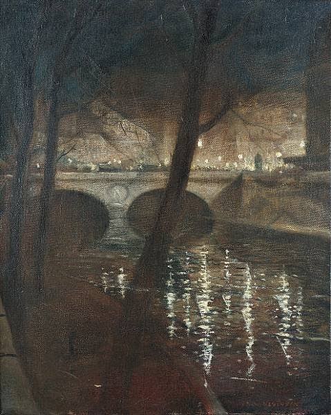
Where my interest lies is the overall atmosphere he created in his work. The mood I see in his artwork feels the same as the one from Whistlers and Nicholas Wright's work. The scenes he created are very moody and pull the viewer in quite well. Just as with the other artists, you don't focus on the contents of the painting as much as you do on the quality of the light.

Another thing I like about his work is the depth in some of the pieces. The painting to the left is called 'The soul of the Souless city' (New York - 1920). "Nevinson painted this picture when he returned to London. The painting shows an imaginary section of the elevated railway running through Manhattan. The railway line recedes dramatically into a cluster of skyscrapers. The angular shapes and muted brown and grey colours suggest the speed and technology of the modern city"

This painting reminds me of some of the streets in Piccadilly Circus from which I photographed and looking back to it, it looks very similar to this artwork.

As a response to the artist, I produced an abstract Photoshop piece. I used various techniques and processes such as layering multiple images and cropping, rotating and resizing parts of them to fit on the background. Nevinson created those tall structural pieces and I wanted to try doing something in that style, but with my own influence. I used my installation images to produce this response.

When working on Photoshop, I made sure to look back at the artists work to get the mood that image captures. It makes you feel overwhelmed by the structures surrounding you so what I did was used a small figure at the front to create a perspective of someone looking at the buildings as if they were standing there. I used duplicating to create multiple small structures all around the figure to capture this strong feeling of being overwhelmed by buildings.
Light is very important for me in this project so I used various contrasts and brightnesses while experimenting and then combined them into this single response. I was able to capture several moods and then combine them ins a single Photoshop piece. The artist did a similar thing, but he didn't combine different images and instead he used different settings and combined them while maintaining balanced light throughout the piece. I wanted to push what the artist has already done with different settings and use various settings of my own in a single piece, but each having their own mood and atmosphere.


Links to other artists
I think this artist links back to my other artist Nicholas Wright. Both artists created those massive cities and create a very moody atmosphere that pulls you into the artwork. Both artists created depth in their works which allows the viewer to truly explore the piece. 


Process and experimentation towards the final piece

Before I created the final Photoshop piece, I experimented with different techniques and processes on Photoshop first. I was very interested in how I can manipulate the light in an image and then combine it with other images to create a whole new impression of the place, but still containing the quality of the light from both.

What I did was take an image that I had a lot of depth in it. That was placed as the background image. I then experimented with the brightness and contrast and started to look into how that affected the image. I realised that adding around 25% more contrast and brightness, the image would make the light more visible and make the surrounding buildings darker while the light itself much brighter.


Another tool I used was Hue & Saturation. This tool allowed me to manipulate the color of the image and mix other colors along with that. What I was able to do is make one area blue and the other orange and what I used that for was made the surrounding buildings blue and all the windows orange and what this did was created an impression of warmth and cold in the image where the insides of the buildings appeared much warmer that the outside.

When I was happy with the background, I was then able to add more layers onto the experiment. I took another one of my photographs and repeated the above steps, but at the same time used other techniques. One of them was cropping and cutting the image in half as well as getting rid of the background so only the buildings were visible. This allowed me to bring the image to the front and create more depth in the piece even though it was made of 2D photographs.


I also experimented with the transparency of the layers. Some of them covered too much from the front so by making them more transparent, I was able to make the things in the background more visible while still having the current layer at the front.

In the end I was able to produce 2 very interesting experiments that would lead me towards my final piece. In my final piece, I want to use all of those techniques and processes and push the outcome to the highest standards I can get it to.


Monday 13 May 2013

Final Piece

My final piece consists of a single Photoshop panel. Out of the many photos I've taken, I picked a handful which I found the most interesting and begun experimenting with them on Photoshop. 
The purpose of using Photoshop was to create this great illusion of different aspects of light together. 

The process of the installation can be found in the Evaluation section of the final piece.

The main aspect of those panels was the light. I wanted to try and manipulate the lights as much as as possible in order to get out the best qualities of light each image possessed. To do so, I used the 'Hue / Saturation' tool on Photoshop as well as the 'Curve' option which allowed me to manipulate the brightness and contrast of each of the layers.
I also used multiple layers which is simply a technique where you add another photo on top of another. I was able to move it around, crop them and resize them at my will and combining that with the color manipulation, I was able to turn each layer into something interesting.
After I got enough layers, I would merge them together and finish off with any final contrasting and saturation's of the image.

I think my final image ended up successful because they clearly link back to my artists as well as demonstrate the illusions of light in Piccadilly Circus and with that, I have met the specified requirements of my client 'Chestnut Grove' Which can be found in the Brief and Proposal section of my blog.

The Final Piece


What it would look like in a galley space


Thursday 9 May 2013

Evaluation


Title: Light and illusion


Candidate Number: 6034


Candidate name: Adam Borowski


Theme: Light and Illusion

My theme is Light and Illusion. The client I’m creating the piece for is Chestnut Grove. The purpose of my piece of work is to show the unseen beauty of light and how it is merely an illusion before you start to explore it. The final piece will be a series of Photoshop images or Photographs of the final outcome demonstrating that. My ideas came from a vast research i did in Piccadilly Circus and parts of Balham. The research included a huge variety of photographs which made photography my main primary source. I also collected leaflets, food wrappers and any junk I had left over by the end of each of my day during the holiday. The photographs can be seen from the ‘Primary and Secondary Sources’ section of the blog.
Some of my primary ideas revolved around rooms and how different lights affect the room which is something I’ve done in my research in the current theme, but I had to expand the idea of light to give me more options. Before I thought of light, I was thinking about doing something more mechanical with the use of technology and how people nowadays depend upon this technology. It was an interesting topic which I would have done if I didn’t think of the theme I have right now. As much as I’m interested in technology, I also like to experiment with things I don’t usually experiment with and light was a great opportunity to do so which made me stick to that theme.
The idea of light being an illusion came struck me from looking through some of the photos of Trocadero which is a huge underground arcade in Piccadilly Circus. The experience of light hitting you from all sides and the way it causes dizziness is like an illusion.
I begun doing some research on the artist and two which caught my eye from the start were Bruce Nauman and Dan Flavin.  The artists used neon lights and a range of different ways to spread them or place them in a room to fill it with light. This linked back to my research of the arcade where artificial lights were the only light source in the building and they filled the whole arcade with various colors.
Another group of artists I came across were Whistler and Nicholas Wright. Whistler was a painter who created very distorted paintings of rural areas in which each captured their own atmosphere and mood. Nicholas Wright on the other hand was a sculptor who created paper buildings and even full cities and then by allowing ways light can go through e.g. windows and doors, with use of light, the artist would light the whole sculpture up and bring it to life.
Whistler’s idea of capturing a mood linked back to some of my very distorted photos in my research. They each felt different from another and carried their own atmospheres within. I also found Nicholas Wright interesting because of the use of light to ring a paper sculpture to life. The idea of an object relying on light to be truly beautiful linked back to the arcade as well as some of the outdoor images where a building would only look nice when light shined upon it.  
My first responses came from Dan Flavin. I created small rooms out of foam board and then lit them up with light from various angles and used color filters to see how different colors affect the space in our eyes. I used the buildings from my primary photographs to create the small structures out of foam board.
I then went into 2-D and used chalk to create a variety of experiments and responses to Whistler. Using the distorted photos from my research I used chalk to create small responses in the style of Whistler but with my own influence. I also took one response from Nicholas Wright which was a 2-D paper collage of a city and using Photoshop, used contrast to give the image a different atmosphere. This gave me an idea to do some more distorted photographs as a response itself.
Nicholas Wright gave me ideas for some other interesting responses. I took a piece of paper and did some outline cut-outs of my primary sources to create an image of a city fading away. I kept overlapping the image with more layers and allowed some light to go through it. Under light, the image turned distorted and moody and while doing this as a response to Nicholas Wright, the image was a bit more of a response to Whistler as it was hard to see in it.


The ideas of these responses which I carried through to the final piece were the small 3-D installations with light as well as the distorted image using chalk and collage. I wanted to use those and recreate it in a bigger scale. On the exam day, I took the most interesting photographs and responses most of which were from Piccadilly Circus.


Using those sources, I created a plan of having a set of buildings made out of various different materials with different transparency and some that are not transparent at all. The idea was to create a set similar to what Nicholas Wright created, but I wanted to create actual buildings instead of having everything flat paper. The buildings themselves were made out of thick card and foam board and for the windows, I experimented with a variety of material such as tracing paper, sugar paper, tissue paper etc to see how light can affect the whole thing when it’s lit up with light. The idea was to create those buildings and then use light to bring the whole thing to life. I have a dark room in the school which allowed me to take this to the highest level where I could have a completely dark room and the only thing that the final piece depends on is light. Once everything was lit up, I took hundreds of photos and the ones which came out the most interesting would go to the very final piece.

Side View 2:


Side View 1:


Bird's Eye View:


When I assembled the whole set, it looked a bit empty at the start because all I had were the structures and white paper as the floor. To overcome this, I placed some large sheets of white card to go around the installations so when I take the photographs, the images would have more depth and make you think that there is something behind all those buildings.

The good part came in when everything was lit up. I feared that some of the materials I chose such as sugar paper and such would not be very transparent with light, but it ended up that even foam board has a little bit of transparency with the light being so strong. I think that the choice of materials was very good and overall the idea for this final piece was successful.


When I took the photos, I used 2 different cameras. One which was my phone and I took around 50 photographs before the battery ran out. I then used the school's camera to take hundreds more from all sides and angles. The good thing about using those different cameras was that each had a different lenses and effect when the photos were taken. My camera was a bit more brighter and got some very similar photos with the same atmosphere that Nicholas Wright had in his artwork. The school camera took much darker photographs and made it seem as if the scene took place at night and the light posts lit everything up instead of the actual light bulbs. 


Overall I think I have met the client needs. I successfully created an installation and took photos of the final outcome which I refined using photoshop. The final piece is a successful piece of art which clearly links back to my research as well as the artists and I believe that it sustained it's purpose. 

Thursday 28 March 2013

Nicholas Wright

Nicholas Wright (1940) is a British dramatist. He opened and ran the Theatre Upstairs at the Royal Court Theatre, was joint artistic director of the Royal Court and is a former literary manager and associate director of the Royal National Theatre. Other than a dramatist, he is also a sculptor who uses paper as well as lights to create contemporary art in form of light sculptures. He uses paper to create cut-outs of buildings and assembles them in a very dramatic way that when you put a light to it, everything comes to life.

I find this very interesting because this artist uses light to his advantage and creates something that wouldn't be what it is without this light. The image below shows a sculpture built around a lamp. When you light this lamp up, it becomes a scene of a large city.
For first impression of his work I was amazed by how much depth his work has and that he uses simple buildings and trees to create such an atmosphere.
His work itself gets me into a mood as if I was at the scene. The light creates a contrast and by using multiple layers of paper, he create tones and used it to change the brightness of the scenery. Everything is darker close to you and as you look at the horizon, the whole place is lit with light very similar to what you would expect if you were standing there.


What I like about his work is the feeling you get when looking at his artwork. It doesn't look like paper when you first glance at it. You only start to realize what it's made off after you finish looking around. 

As a response, I used one of the images I took in Piccadilly Circus and created a small paper installation on the style of Nicholas Wright, but with influence from Whistler. 

I took a piece of blank paper and drew the outline of the sky box from the image. I then stuck the sheet of paper to another and cut it out leaving me with 2 layers of paper that will go at the back of the response. I did the same for the lamp posts and the people at the front of the image. Nicholas focused on the detail of his sculptures, but since I wanted this response to be influenced bu Whistler, I didn't go for any detail and made it simple, but at the same time, I captured an atmosphere in the image. I took a photo of it during night when all lights were out, placed a torch behind the response and took an image. The response below was the result. 

I want to take this little experiment and carry it through to make a full response to Nicholas Wright himself because the one below was influenced by multiple artists. Also I will take the experiment I already have and produce a sketch while still capturing the mood and see if chalk can capture the same feel the response below did.


I realised that creating 2D responses to this artist will not be enough to fully explore it'spotentials. What I did was created a large installation where I used various transparent materials to create a small recreation of buildings from my primary sources and existing responses.
I was able to recreate the mood that Nicholas Wright has captured in his own artwork. I can that because each of those images give out their own impression and each contain their own atmosphere. You can also tell that each has their own perspective as well as different light which was achieved by using multiple cameras to record this response.


Tuesday 26 March 2013

Algernon Charles Swinburne

Swinburne (London, 5 April 1837 – London, 10 April 1909) was an English poet, playwright, novelist, and critic. He invented the roundel form and wrote several novels. As a poet, he was known to respond to already existing paintings, but he would respond using a poem. One of his poems were inspired from one of Whistler's paintings and it was called - Poem- Before The Mirror. It is also said that Whistler responded to this poem instead of the poet responding to him, but it is unknown which is correct.

My idea is to capture the quality of light in a way to make it seem like an illusion. To make the purpose of this even stronger, I decided to widen my range of ways to look at the light around London. Poetry is a great way to describe something using powerful words that quickly trigger your imagination.  

I want to take this idea and go out responding to the light responding to poetry which is something I have never tried before and perhaps using different words to describe the light will have a different effect on how I end up drawing it.

Tuesday 12 March 2013

James Abbott McNeill Whistler


James Abbott McNeill Whistler (July 11, 1834 – July 17, 1903) was an American-born, British-based artist. Averse to sentimentality and moral allusion in painting, he was a leading proponent of the credo, "art for art's sake". 
Whistler’s paintings are usually subtle and sensitive, but his views on art were outspoken and progressive. He thought that painting should deal mainly with abstract qualities such as colour and shape, rather than with subject matter.


Whistler's work was usually called 'unfinished' or 'unrefined'. When looking at his work, you can see that it is indeed blurry and looks a bit rushed, but it's the opposite. The effect captured in this image is almost like the mood you get if you were the place yourself. The color and shape of the picture make you feel as if you're looking through someones dream and a big impact on this is the light used in the image.

My first impressions were similar to what some people call the work. "Unrefined", but that was just from the first glimpse at his work. As I looked deeper into it, I realised how abstract the piece is and how it quickly pulls you into the environment created by the artist in the painting.

The artist used color, texture, shape and tone as the main formal elements, but line is also recognised. The artist carefully distorts the color in the image making it feel very foggy and misty.

The reason I want to use the artist in my project is because he uses light is a very different way than most artist. He focuses on the light during night time and this is what I got interested in. Many of my photographs include scenes from night. Piccadilly Circus is very fascinating when you go there during night time and I want to create responses from that place during night using the techniques Whisper used in his paintings.


Responses

I wanted to use photographs that give out a similar feel to Whistlers work when creating response. The image below shows a tunnel area. It was distorted by the two lights at the top and bottom to cover the whole image in a coat of light. Whispers work usually focuses on the lights during night time so as a response, I used an image that would work well as a night image.


I used chalk to create the response. The photograph has a wide variety of shades which I could easily achieve using different shades of chalk. The biggest difficulty was getting the corners bright after I already used the dark shades.

I also took photographs of scenes similar to the ones Whistler captures using paints. The one below was taken right outside my window just before the sun set all the way down. You can only see a glimpse of the light in the background and this light gives a blurry outline of the trees in the image. Whistlers work mainly focused around shape and color rather than what was in the painting itself and in this photograph, I believe I achieved this very meaning.
Whistler would also say "As music is the poetry of sound, so is painting the poetry of sight, the subject matter has nothing to do with harmony of sound or color". The quote says that what is important in the painting is not what you can see, but what you should be getting out of it. He looks at the aesthetic quality of what he sees. He takes out what is not important and leaves what he finds the most beautiful which is also something that I am doing with light itself. 


I used one of my paper cut outs from previous responses to Nicholas Wright and placed a light bulb behind the response. While responding to Wright, I used natural light behind the response, but this time decided to go for an artificial light which was a light bulb. I used more than one type of paper which allowed the light to pass the object easier with some materials than the other. It worked the best with tracing paper which was used as the sky in and sugar paper for the van and the people in the image. It gave out a feeling as if there was a sun all the way behind those buildings and also distorted it making the viewer focus a bit more on the quality of light than the actual content of the response.


While responding to Nicholas Wright using my large 3D installation,I decided to push that towards Whistler too. I went to Photoshop and experimented with the qualities of light in an image and was able to come up with some very interesting responses.


What I really like about these responses is that the viewer focuses on how the light effects the buildings rather than the buildings themselves. The light in these images is very strong and creates a nice contrast between the objects and the light as the buildings appear much darker and allow the light to stand out much more. I think those responses successfuly link to Whistler because they capture and demonstrate the quality of light and just as in Whistler's work, you want to focus on how the light effects the installation rather than the installation itself.


Links to artists


To me, Whistler is an artist who links with my theme in his own way. He works differently from the other artists and uses different techniques to other painters. The one thing I think links to others is the atmospheres created in his artwork. Most of my artists create a feeling in their work as if you're in a different place all of the sudden. Whistler created paintings the bring you into a very gloomy atmosphere and a similar thing happens with Manet's paintings. Both of the artists paint differently and have different intentions, but their work has the same effect on you if you're looking at them for the first time without knowing what they represent.

Whistler uses very little light in his work and it's pretty much the opposite of my other artists, Nauman and Flavin. They work with neon lights and create an atmosphere using a whole room using light.

An artist I think that goes between the neon users and the painters is Nicholas Wright who works similar to Whistler by creating a feeling that you're in a city and there is much depth in his work, but instead of it being a painting, it's an installation. It still however gives the same feeling you get when you look at Whistler's work. His work also might not use neon lights, but the work itself depends on light and without the light, he can't create the atmosphere just like Nauman and Flavin.

Tuesday 5 March 2013

Royal Academy or Arts (Manet Exhibition)

At 15th of March, I visited the Manet's Exhibition at the Royal Academy of arts in Piccadilly Circus. I was looking at an artist named Eduard Manet who specialized in scene painting during the 17th century. 

The exhibition was not the most ideal for the theme I picked which is light because the artist mainly focused on people. I ignored the meaning in his work and focused on his techniques which I found much more interesting and related to my theme.  


(Below) The tragic actor - 1865 (Rouviere as Hamlet)

"Manet invited Philbert Rouviere (1809-65) to celebrate the actors retirement". 
When I look at the painting from up close, it feels as if I was at a photo session. The light that is built up behind the figure, makes him stand out almost as if he was standing in front of you. The background is blank with nothing to focus on other than the person in front.


We were not allowed to take any photographs at the exhibition which limited me to taking information as well as talking about the work from the first person perspective. I also drew some quick sketches of his work.

The work below is named 'Fishing' 1862-93. I wrote some first person experience comments while looking at the painting. What I saw in the texture of the surface, I wanted to capture with text and said "The dark forest near the bright hills with a glazing sun behind create a strong contrast in the painting. When looking at it from up close, you can take your time while exploring the piece as you get absorbed by every tiny detail of te painting. The color pallet is very vast and with such a large variety of color, the light and the darker parts of the piece can create a very real feel in the place". Although it doesn't look realistic when you look at it, the actual feeling you get is the same as if you were in the painting. 

The game of Croquet (1873)
"The painting rewards a contemporary bourgeois leisure pursuit"
When looking at this painting, I feel absorbed into it by the wide color pallet. The artist used several shades of green to create a very thick background and using some lighter shades, he created places where light would go through. The deeper you looked at the painting, the less light was going through the tree tops which made your eyes wander into the depths of the forest. 


Eduard Manet


Eduard Manet was born 23 January 1832 into the upper-middle class social circle he often presented his portraits and genre scenes of everyday life. Manet merged such artistic influences with his varied interests (Including music, fashion, literature and photography) to create innovative and distinctive portrayals of a city and society undergoing irrevocable transformations. In 1858, Manet befriended the poet Charles Baudelaire who came to define and essence of modernity in his 1863 essay.


Manet walked about Paris daily in the early 1860s usually with Baudelaire, recording its changes in his sketchbook (At his times, Paris was at a stage of a cholera outbreak. The streets were filled with dirt and Paris itself was filthy). Manet painted visibly solid strokes, suggesting from through blocks of color. In so doing, he draws the viewer's eye as much to the act of painting as to the depicted scene.

I want to use Manet's work not so much for the narrative, but more to explore the technique he uses to achieve the effect his paintings give out.

The reason I find this artist interesting is that he thought about how he wants people to look at his paintings. Instead of painting such as one of the impressionist paintings of Théodore Chassériau: The Two Sisters, 1843 which was a staged portrait, Manet's work is about capturing the moment which cannot be staged, but instead is captured within seconds and then coming back to it and refining it altogether. He achieves that by using simple strokes to add detail, but before that he applies thick blocks of color which makes the viewer's eye look deeper into the painting when detail is applied afterwards. The thick blocks of color simply give a 3D perspective when you look into his artwork. The quote "Manet's composition encourages the viewer's eye to travel across and into the canvas" (By Alison Bracker) means that the techniques he uses influence the viewer and completely change the way they approach the painting.
This links back to what my original intent is in this project. I want to change the way the viewer looks at something by using a different technique to what you would usually expect causing an illusionary effect. This then makes the viewer want to figure out the purpose and what the artwork is. 


My first impressions of his work were that it was just another artist who paints what he sees in front of him e.g. an artist who stages his work and the paints it, but as I analysed the artist and the meaning behind his work as well as techniques he uses, I recognised him as an incredible artist who's painting mean more when you look deeper into them and they were not staged at all.

My project is mainly focused around placed, installations and 3D in general. The painting above clearly looks 3D and the way the artist gets the effect makes me want to explore it more in depth. It makes the viewer want to explore it and look around t as you can't catch everything from a single glance. Although I do not want to focus on paintings in this project, I want to create responses from my sources using paints and this artist is the key to what I want to achieve in my responses. Many of my photographs represent interior places such as corridors. Using the techniques the artist did, I want to in-cooperate that in my responses to photographs from Piccadilly Circus and Balham.  

The artist uses tone, texture and shape to achieve the 3D-ness in his work. The shape of the brush strokes makes it easy to see the difference in tone and the brush stroke itself creates texture that fits the atmosphere in the painting. As you look deeper into it, you can see the strokes getting smaller until they're just dots. The artist makes the viewer's eyes travel across the canvas and look deep into it.

The mood created in his artwork makes you feel as if you're part of the artwork. You can look so deep into it, it makes it seems as if you're looking down a long path just as you would in real life.

The thing I like most about this image is that the way the artist painted it. He wanted the viewer to explore the canvas to it's fullest and that would usually be impossible on a flat painting, but the artist's technique create this very 3D effect on a flat surface.

One thing I do not like about this painting is the choice of color. Manet could have used a wider variety of browns when painting the buildings to make it a bit more colorful. The dull colors make the viewer not want to focus in the buildings as much which is the opposite of the artists intent.  

The artist's intent was to capture the moment of his life and only drew what was precious to him. He would ignore anything that is irrelevant in his memory e.g. in one of his artworks he drew a massive amount of people from a fair, but did not include the musicians because they were not important to him.

Responses:

As a response to Manet, I created a small painting in which I used thick blocks of color as well as multiple layers to create very dark solid tones. 
What I really like about this response is how the red flare gives an impression of there being a sun behind the block. It shows depth as well as a 3-D effect in the image because it makes you think that there is something behind the object. It is also something that Manet often did with his technique and I think this response has shown that very well.


Wednesday 27 February 2013

Responces and Experiments

This post will show the responses I do from my photographs and primary sources I collected from around Picadilly Circus and Balham. I will be working from photographs as well as collectibles I gather from these places.

The images below show my experimentation of changing the atmosphere of a place by simply changing the light around it. The first three images show an attempt of making the photograph seem as if it was taken at different times of the day. In the first photo, you can see the the sky is clear blue and the other two they look as of if the skybox was filled with gray clouds. When you compare the two, look on the inside of the building. The atmosphere changes completely as well as the mood just from changing the brightness of the background.

The purpose of this experiment was to explore the idea if changing the viewers experience of an image from just changing the light. The experiment was not successful because I cannot expand from this and it wouldn't help me in future progress.

The second experiment I did on photoshop was another light experiment through changing the brightness of the image. This photograph was taken at the Balham tube station. It shows how changing the brightness down makes it feel like a different time of the day.

The image below shows the original. Even from this image , you can see that the inside of the tube station feels very different from the outside. You wouldn't expect it to be that bright or you would at least expect to be brighter inside as well. This image is actually a second where you're about to go out of the tube station. Everything around you goes dark and the outside turns very bright as your eyes try to adjust to the surrounding. The purpose of experiment was to see if a photograph can capture the same experience you get through your own eyes. I was able to capture this experience and then experiment from it meaning the experiment was successful.


I think that this experiment is a combination of the artists 'Whistler' as well as 'MC Escher'. The experiment doesn't link directly with the meaning of their works but the techniques they used. Whistler would use light and atmosphere to his advantage and use it to create a distorted image. I also used the light, but also just as Escher uses impossible building to cause confusion, I changed the brightness of light to change the viewers point of view of the image. As you look from image to image, you believe it's different time of the day , but  at the same time you cannot tell which image is the original.

I can use this experiment to create 3D installations that will link to Whistler and Escher and also use other types of media such as videos, paints or chalk.  


The photograph and experiment below link with two of my artists 'Whistler' and 'Manet'. The photograph was taken in the way Whistler would paint his work. It is distorted which makes the viewer less aware of the objects in the photograph. I wanted the viewer to focus around the shape and light which is the same feature Whistler looked at when painting his work.


The experiment on the other hand links with Eduard Manet. As I mentioned before hand, I am more interested in his techniques rather than meaning in his work. This response was created using chalk. Chalk was ideal because it was shaped like a brick. Manet painted his scenes in a very 3D way where you can look very deep into the painting. In order to do that, he used thick blocks of color that would be pointed into the centre of the painting creating a 3D feel. I used chalk to create this very effect and drew with thick strokes. What this did, was allowed me to quickly capture 3D-ness in the response. As you look at it, you can look deep into it and it feels as if you're actually standing in this huge corridor.

As well as Manet, this is also a response to Whistler. I didn't try to add much detail in this drawing and I also tried to capture the light from the photograph. I used thick coats of white chalk in the corners and then focused the light towards the centre of the image. This has also influenced the 3D-ness of this painting and it almost feels as if you were running through this corridor and everything around you got distorted. 
I believe this experiment was successful and I will carry on creating more of these in later stages using chalk as well as paints, pencils and drawing these in different sizes such as A2, or A5. 


One day when I came back from college, I took blurred photos from outside of the windows in my house. I took them by looking through the glass and at the time, the glass was very wet and it made everything you see look distorted and it reminded me of some of 'Whispers' work and I decided to use those images to create responses. These responses will not only be flat drawings, but I believe I can take these images to create 3D installations by taking the image apart and putting it into sections one by one creating a 3D effect when looking into it. Whistler focused on the idea of shape and color which can be fully explored using installations by adding and taking away from what is already present which also links to another artist 'M.C. Escher who was pulled into the idea of making something look impossible just like a puzzle which doesn't have the right pieces, but yet is still the whole thing.  I also know that Whistler would simplify his paintings and describe them as 'Harmonic' which was why he made them look so mysterious. I want to apply these ideas when creating my responses.  


As a response to Whistler and Bruce Nauman, I decided to do a series of small installations. It was simply an outline of a city and some trees and I placed a torch around this small installation looking at how it would affect it when placing the light from different sides. All the photos were taken in dark in order to focus on the light itself and nothing else.
In the image below, I used the blue carpet of my room to create a watery effect. As you look down at the image, it feels as if you're standing far away from it which means it created a 3D effect. Nauman was an artist who wanted people to move around his neon installations. The whole purpose of his work was to force people to move around in order to explore it's full content and this was achieved with the quality of light. If I moved the torch from it's original place, it made it seem as if you were standing kilometres away from the light source even though it was moved a few inches. 


The image below shows an experiment of putting the torch behind the installation. I used a metal sheet as the background and since it's metal, it was scratched all over and the light made it seems as if those scratches were stars. I found this interesting because when I moved the camera angle, the whole image looked way different. The quality of light changed significally and it turned from dim blue to bright white. It might have been that the metal in the background had an effect on the light which would change the brightness if you looked from another angle.

This is the same image and the only difference here is the position of the camera. The whole perspective has changed and this is just about 15 degrees to the right. This links to Bruce Nauman as he wanted people to experience something else each time they moved around his installation. In these images, you can experience different qualities of light just from moving around it.


Whistler was very interested in the quality of light and not so much in what was in the image. Below, I took a very distorted photo of my installation while having the torch very far away leaving only a bit of light. When you look back at Whistler's work, you can clearly see the light resemblance between his work and the image below. When you do not see anything except the light in the image, you start to take a much bigger interest in the light itself than anything else. It goes into Whistler's idea of 'harmony' in the image

I have researched artists who might do such experiments with paper and I found an interesting sculptor who works with paper and light called Nicholas Wright. The mood he sets in his work is also very similar to Whistler; however instead of paintings, he creates a sculpture that he build around a lamp and when lit up, the whole scene comes to life. What I found very interesting about that is that you can use different color or brightness of light to set different moods for the same sculpture. This is something I want to carry through and I will be creating more responses to Nicholas Wright as I progress.

I created a small light box which I filled with different color filters and created various small responses that I linked to other artists such as Bruce Nauman and Dan Flavin. Both of these artists used different color lights to pull you into various moods created by different colors. I even created a small video as a response to Dan Flavin showing off the variations in color in this set.