Tuesday, 14 May 2013

Christopher Richard Wynne Nevinson

Christopher Richard Wynne Nevinson (13 August 1889 – October 1946) was a British figure and landscape painter, etcher and lithographer. He is often referred to by his initials C. R. W. Nevinson, and was known as Richard.

I find Nevinson interesting because of the quality of light in his artwork. He painted in a very cubist/ futuristic style and his work often included cities which is where my project is set.

My first impressions of his work were that the work was quite dramatic. The paintings often showed scenes from the war period and were almost like a memorial to those who have fallen in the war.

Where my interest lies is the overall atmosphere he created in his work. The mood I see in his artwork feels the same as the one from Whistlers and Nicholas Wright's work. The scenes he created are very moody and pull the viewer in quite well. Just as with the other artists, you don't focus on the contents of the painting as much as you do on the quality of the light.

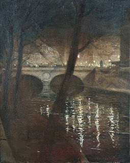
Another thing I like about his work is the depth in some of the pieces. The painting to the left is called 'The soul of the Souless city' (New York - 1920). "Nevinson painted this picture when he returned to London. The painting shows an imaginary section of the elevated railway running through Manhattan. The railway line recedes dramatically into a cluster of skyscrapers. The angular shapes and muted brown and grey colours suggest the speed and technology of the modern city"

This painting reminds me of some of the streets in Piccadilly Circus from which I photographed and looking back to it, it looks very similar to this artwork.

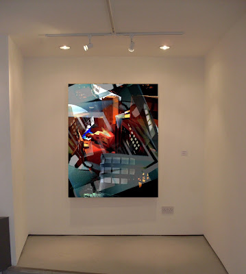
As a response to the artist, I produced an abstract Photoshop piece. I used various techniques and processes such as layering multiple images and cropping, rotating and resizing parts of them to fit on the background. Nevinson created those tall structural pieces and I wanted to try doing something in that style, but with my own influence. I used my installation images to produce this response.

When working on Photoshop, I made sure to look back at the artists work to get the mood that image captures. It makes you feel overwhelmed by the structures surrounding you so what I did was used a small figure at the front to create a perspective of someone looking at the buildings as if they were standing there. I used duplicating to create multiple small structures all around the figure to capture this strong feeling of being overwhelmed by buildings.
Light is very important for me in this project so I used various contrasts and brightnesses while experimenting and then combined them into this single response. I was able to capture several moods and then combine them ins a single Photoshop piece. The artist did a similar thing, but he didn't combine different images and instead he used different settings and combined them while maintaining balanced light throughout the piece. I wanted to push what the artist has already done with different settings and use various settings of my own in a single piece, but each having their own mood and atmosphere.


Links to other artists
I think this artist links back to my other artist Nicholas Wright. Both artists created those massive cities and create a very moody atmosphere that pulls you into the artwork. Both artists created depth in their works which allows the viewer to truly explore the piece. 


Process and experimentation towards the final piece

Before I created the final Photoshop piece, I experimented with different techniques and processes on Photoshop first. I was very interested in how I can manipulate the light in an image and then combine it with other images to create a whole new impression of the place, but still containing the quality of the light from both.

What I did was take an image that I had a lot of depth in it. That was placed as the background image. I then experimented with the brightness and contrast and started to look into how that affected the image. I realised that adding around 25% more contrast and brightness, the image would make the light more visible and make the surrounding buildings darker while the light itself much brighter.


Another tool I used was Hue & Saturation. This tool allowed me to manipulate the color of the image and mix other colors along with that. What I was able to do is make one area blue and the other orange and what I used that for was made the surrounding buildings blue and all the windows orange and what this did was created an impression of warmth and cold in the image where the insides of the buildings appeared much warmer that the outside.

When I was happy with the background, I was then able to add more layers onto the experiment. I took another one of my photographs and repeated the above steps, but at the same time used other techniques. One of them was cropping and cutting the image in half as well as getting rid of the background so only the buildings were visible. This allowed me to bring the image to the front and create more depth in the piece even though it was made of 2D photographs.


I also experimented with the transparency of the layers. Some of them covered too much from the front so by making them more transparent, I was able to make the things in the background more visible while still having the current layer at the front.

In the end I was able to produce 2 very interesting experiments that would lead me towards my final piece. In my final piece, I want to use all of those techniques and processes and push the outcome to the highest standards I can get it to.


Monday, 13 May 2013

Final Piece

My final piece consists of a single Photoshop panel. Out of the many photos I've taken, I picked a handful which I found the most interesting and begun experimenting with them on Photoshop. 
The purpose of using Photoshop was to create this great illusion of different aspects of light together. 

The process of the installation can be found in the Evaluation section of the final piece.

The main aspect of those panels was the light. I wanted to try and manipulate the lights as much as as possible in order to get out the best qualities of light each image possessed. To do so, I used the 'Hue / Saturation' tool on Photoshop as well as the 'Curve' option which allowed me to manipulate the brightness and contrast of each of the layers.
I also used multiple layers which is simply a technique where you add another photo on top of another. I was able to move it around, crop them and resize them at my will and combining that with the color manipulation, I was able to turn each layer into something interesting.
After I got enough layers, I would merge them together and finish off with any final contrasting and saturation's of the image.

I think my final image ended up successful because they clearly link back to my artists as well as demonstrate the illusions of light in Piccadilly Circus and with that, I have met the specified requirements of my client 'Chestnut Grove' Which can be found in the Brief and Proposal section of my blog.

The Final Piece


What it would look like in a galley space


Thursday, 9 May 2013

Evaluation


Title: Light and illusion


Candidate Number: 6034


Candidate name: Adam Borowski


Theme: Light and Illusion

My theme is Light and Illusion. The client I’m creating the piece for is Chestnut Grove. The purpose of my piece of work is to show the unseen beauty of light and how it is merely an illusion before you start to explore it. The final piece will be a series of Photoshop images or Photographs of the final outcome demonstrating that. My ideas came from a vast research i did in Piccadilly Circus and parts of Balham. The research included a huge variety of photographs which made photography my main primary source. I also collected leaflets, food wrappers and any junk I had left over by the end of each of my day during the holiday. The photographs can be seen from the ‘Primary and Secondary Sources’ section of the blog.
Some of my primary ideas revolved around rooms and how different lights affect the room which is something I’ve done in my research in the current theme, but I had to expand the idea of light to give me more options. Before I thought of light, I was thinking about doing something more mechanical with the use of technology and how people nowadays depend upon this technology. It was an interesting topic which I would have done if I didn’t think of the theme I have right now. As much as I’m interested in technology, I also like to experiment with things I don’t usually experiment with and light was a great opportunity to do so which made me stick to that theme.
The idea of light being an illusion came struck me from looking through some of the photos of Trocadero which is a huge underground arcade in Piccadilly Circus. The experience of light hitting you from all sides and the way it causes dizziness is like an illusion.
I begun doing some research on the artist and two which caught my eye from the start were Bruce Nauman and Dan Flavin.  The artists used neon lights and a range of different ways to spread them or place them in a room to fill it with light. This linked back to my research of the arcade where artificial lights were the only light source in the building and they filled the whole arcade with various colors.
Another group of artists I came across were Whistler and Nicholas Wright. Whistler was a painter who created very distorted paintings of rural areas in which each captured their own atmosphere and mood. Nicholas Wright on the other hand was a sculptor who created paper buildings and even full cities and then by allowing ways light can go through e.g. windows and doors, with use of light, the artist would light the whole sculpture up and bring it to life.
Whistler’s idea of capturing a mood linked back to some of my very distorted photos in my research. They each felt different from another and carried their own atmospheres within. I also found Nicholas Wright interesting because of the use of light to ring a paper sculpture to life. The idea of an object relying on light to be truly beautiful linked back to the arcade as well as some of the outdoor images where a building would only look nice when light shined upon it.  
My first responses came from Dan Flavin. I created small rooms out of foam board and then lit them up with light from various angles and used color filters to see how different colors affect the space in our eyes. I used the buildings from my primary photographs to create the small structures out of foam board.
I then went into 2-D and used chalk to create a variety of experiments and responses to Whistler. Using the distorted photos from my research I used chalk to create small responses in the style of Whistler but with my own influence. I also took one response from Nicholas Wright which was a 2-D paper collage of a city and using Photoshop, used contrast to give the image a different atmosphere. This gave me an idea to do some more distorted photographs as a response itself.
Nicholas Wright gave me ideas for some other interesting responses. I took a piece of paper and did some outline cut-outs of my primary sources to create an image of a city fading away. I kept overlapping the image with more layers and allowed some light to go through it. Under light, the image turned distorted and moody and while doing this as a response to Nicholas Wright, the image was a bit more of a response to Whistler as it was hard to see in it.


The ideas of these responses which I carried through to the final piece were the small 3-D installations with light as well as the distorted image using chalk and collage. I wanted to use those and recreate it in a bigger scale. On the exam day, I took the most interesting photographs and responses most of which were from Piccadilly Circus.


Using those sources, I created a plan of having a set of buildings made out of various different materials with different transparency and some that are not transparent at all. The idea was to create a set similar to what Nicholas Wright created, but I wanted to create actual buildings instead of having everything flat paper. The buildings themselves were made out of thick card and foam board and for the windows, I experimented with a variety of material such as tracing paper, sugar paper, tissue paper etc to see how light can affect the whole thing when it’s lit up with light. The idea was to create those buildings and then use light to bring the whole thing to life. I have a dark room in the school which allowed me to take this to the highest level where I could have a completely dark room and the only thing that the final piece depends on is light. Once everything was lit up, I took hundreds of photos and the ones which came out the most interesting would go to the very final piece.

Side View 2:


Side View 1:


Bird's Eye View:


When I assembled the whole set, it looked a bit empty at the start because all I had were the structures and white paper as the floor. To overcome this, I placed some large sheets of white card to go around the installations so when I take the photographs, the images would have more depth and make you think that there is something behind all those buildings.

The good part came in when everything was lit up. I feared that some of the materials I chose such as sugar paper and such would not be very transparent with light, but it ended up that even foam board has a little bit of transparency with the light being so strong. I think that the choice of materials was very good and overall the idea for this final piece was successful.


When I took the photos, I used 2 different cameras. One which was my phone and I took around 50 photographs before the battery ran out. I then used the school's camera to take hundreds more from all sides and angles. The good thing about using those different cameras was that each had a different lenses and effect when the photos were taken. My camera was a bit more brighter and got some very similar photos with the same atmosphere that Nicholas Wright had in his artwork. The school camera took much darker photographs and made it seem as if the scene took place at night and the light posts lit everything up instead of the actual light bulbs. 


Overall I think I have met the client needs. I successfully created an installation and took photos of the final outcome which I refined using photoshop. The final piece is a successful piece of art which clearly links back to my research as well as the artists and I believe that it sustained it's purpose.